1: Match the shadows and light sources. The eye and brain are really good in picking up these cues, especially in photos, where this is how we judge the depth and size of the objects in the 2D picture. At the very least, try to match the primary light source.
Look at your figure. Where are the shadows on the face? If they're on the left, the light source is on the right. If they're on the right, the light source is on the left. If they're under the brows, nose, and chin, then the light is coming from above. This should match your background photo as close as possible. If there are no distinct shadows, or the shadows aren't pronounced, then the light on the figure is diffuse. If there are strong shadows in your background, it won't match.
One trick that sometimes works: if your figure has the light source on one side, and the background has the light on the other, its sometimes possible to flip one or the other (mirror image) and make it match. Obviously this doesn't work if there's something in the image to establish the "handedness" of the image. Any flipped writing will be backwards. Car steering wheels will be on the wrong side (but hey, we could be in England!). And Joe's scar could be on the wrong cheek!
2: Match the contrast of the background. Nothing will give away a "paste job" faster than a high-contrast figure against a washed-out background shot. Your photo editing software will probably have a brightness and contrast tool. It may have other brightness tools that are even more powerful (though they can be more difficult to figure out and use).
3: Match the color tone. Figure photos taken inside under incandescent lights are often "warm" in color tone. Fluorescent light sometimes results in a greenish tone. Photos taken outside under sunlight usually have a bluish tone. Your photo editing software probably has tools to fix this.
4. Match the color saturation. Modern photos taken under artificial light often have bright, over-saturated, colors. Historic photos taken outside often have muted, washed-out colors. Foreground should match background.
5. Match size and perspective. It's pretty basic that things that are closer are bigger, and that things which are farther away look smaller. In a photo scene, things contract towards an imaginary "vanishing point," which (on a flat plain, anyway) will lie along the horizon.
I could go into a big, not very informed lecture about perspective here. Trust it to say that your eyes and brain judge the size and distance of an object in a picture by its position in the picture in relation to other objects.

Take a look at this example I whipped up. The lines on the football field converge on our "vanishing point," illustrated with the red lines converging on the (hidden) horizon). On the left, I've arranged four figures positioned to appear the same height, even though each is about 20% smaller than the next. Note that as they stand on a line towards the vanishing point, another such line connects the tops of all their heads. Yes, I know that they look about 12-feet tall, but they ALL look 12-feet tall. That's what's important.
Now look at the figures standing along a similar line on the right. Believe it or not, these are the SAME four figures. I've just reversed the order. The monster standing back-rightis EXACTLY the same size as the more normal-looking guy standing front-left. The tiny shrimp front right is EXACTLY the same size as the fellow back left.
Likewise, any figure you paste into a photo background has to relate properly to the objects around them, or they're going to appear to be a giant, or a shrimp, or just hanging in the air in front of a distant scene, or worst of all, just pasted on a flat background like a stamp on an envelope.
Experiment with size and position relative to the background, and trust your eye on this. One trick I find useful is to look at the figure's feet. Though the imaginary plain leading off to the horizon may be flat, to your eye it SEEMS steeper as it's closer to the observer, and flatter towards the horizon. If you're looking down at the tops of a figure's feet, then it probably belongs close to the front of your image. If that makes him look gigantic, then he needs to be made slower. If, on the other hand, you seem to be looking at the sides of the shoes straight-on, then he belongs off in the distance, and should be positioned and resized accordingly. Use people, doorways, and other such details as reference in positioning your foreground picture.
Notice how the giant on the right rear seems to be up on his toes, about to topple forward, or to launch himself into the sky. That's a foot position cue at work. He needs to be closer to the bottom front of the picture.
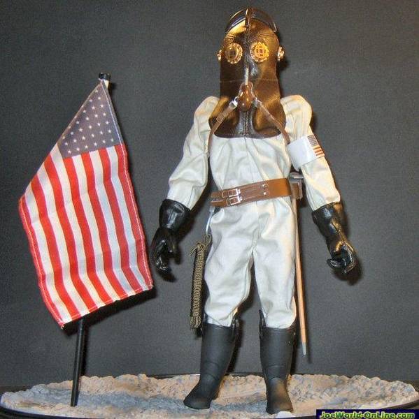
Okay, this is a quick example of putting these rules into practice, hijacking one of Dan's own images, his 1912 lunar astronaut. I've dug a NASA lunar photo out of my files and added him in.
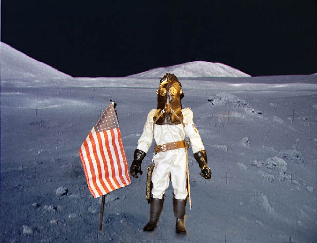
This first example is done wrong. First of all, the position of the figure is wrong. He's too close to the front, and seems to be tipping backwards on his heels. One would expect light on the moon to be bluish and colors somewhat subdued. Instead, the figure is very saturated, and the colors warm. At best, he looks like he's standing in front of a photo backdrop. At worst, it's the stamp and envelope effect.

Now this next one isn't perfect, but it's not bad. I've cooled off the colors in the figure, increased the contrast, and reduced the color saturation, to make him fit with the background better. A couple of additional tricks. I added some blotchy shadows under his feet and to the right of him and the flag. These don't exactly match either the sharp shadows on his suit, of the washed-own and almost shadow-free background, but they do help to "ground" him in the scene. One other little trick, I copied a rock from the background (and reshaped it a bit, but that isn't necessary) and put in in FRONT of the toe of one of his boots. Again, that helps to "stick" him to the scene.
Again, though the figure in the "bad" image seems bigger, it's exactly the same size relative to the background as the "good" image.
This post really just scratches the surface, but hopefully it will provide some useful tips to apply in creating your own photos.