Showing posts with label photography. Show all posts

Tuesday, September 02, 2008

Thinking inside the Box

After doing over 125 "Minions at Work" photo cartoons, I'm getting a little bored. Not with the Minions but with the sets I photograph them on.

My "stage" for the Minions is nothing but a small workbench on which I throw together sets using a variety of backdrops and walls (most built of foamcore board) and a variety of other "wild" set pieces, such as columns, beams, arches, and doorways. I can really do a wide variety of sets by swapping my basic pieces around, but for the most part, they have one thing in common. They're flat.

Because of the single-panel format for "Minions at Work," it's generally important to see all the characters in a scene clearly: who they are, what they're doing, what their body language is, and what they're holding. That's hard to do when you get more than two characters in a scene, especially if you're also struggling to get an interesting angle on the set (something else my current setup makes difficult).

Somebody is always turned the wrong way, or you can't see their hands when you need to, or you can't see what they're holding, or where they're looking, or something else that's important to the scene or the joke.

But it's also difficult to make multi-level sets to my requirement. I need modular flexibility. I need things that are sturdy and versatile. I need things that are self-supporting and that don't eat up too much of my limited (especially front-to-back) bench space. And most of all, I need cheap.

Here's a solution I've come up with (click on any of the images for larger versions):


Yeah, boxes. These are recycled "shoebox" sized Express Mail boxes. I've just glued the flaps shut and covered them with self-adhesive shelf-paper, also known as contact paper.

Contact paper is wonderful stuff, with all sorts of uses. It's cheap, comes in useful sizes, sticks well to most surfaces without additional glue or tape, and can be used to disguise or repurpose all sorts of common objects for use in our 1/6th world.

The big problem is the limited patterns available and their applicability to 1/6th sets. A lot of the patterns are florals or other decorative patterns that aren't much use to me, and there are wood-grain patterns that are way out of scale for 1/6th use.

On the other hand, there are sold colors, geometric patterns (like black and white or other checks, good for floor coverings, and stripes, which have some uses), and metallic. Here's an on-line-site to show you some of the patterns and colors you may also find in your local stores.


I've used the metallic papers before, but for this project, I went with a couple of stone patterns, one a gray granite and another a gray marble.

Why two patterns? Well, while either pattern can be used for both walls and floors, it's my feeling that the coarse pattern of the granite is better for floors, and the smoother pattern of the marble is better for walls.

Also, cover a box with one pattern, and it still looks rather like a box. But if the sides are one pattern, and the top another, then it takes on a bit more weight and reality.

But remember, I said flexible, and that's where I got sneaky. The trick her is that, in a photo, normally you can only see at most three of the six sides of a box. If you see an exposed side with one pattern, you'll tend to assume that the reverse face of the box is the same, but it doesn't have to be.

So for my boxes, I covered the ends, one wide side, and one narrow side with marble, and one wide side and one narrow side with granite. By flipping and rotating the boxes to expose various combination of surfaces, two little boxes can be used for an awful lot of different things.

Let's start with something simple. Stood on ends, the boxes become modular, free-standing wall panels. These can be used to provide a stub wall in the foreground of a picture, or to suggest a doorway or hall where none actually exists. Turn them one way, and you've got granite walls.

Turn them the other way, and you've got marble.

One thing to remember for photo purposes is, it isn't important what you build, it's what people see, and what they fill in mentally to complete the picture.

So while we can see this is just a couple of boxes on end, if you were to zoom in or crop to eliminate the tops of the boxes, the viewer will just assume it's a wall that extends all the way to some invisible ceiling. Same with the sizes. If the picture doesn't show the end of the wall, the viewer will assume it continues well beyond the picture, even if the wall overhangs the frame by a fraction of an inch.

Of course, I've only got two boxes, so the wall is necessarily pretty small. Making two more would allow for much more sizable walls, and the flexibility to create a doorway in the middle.

But while this is useful, my primary purpose for creating these was to create some verticality to my sets. Let's see how that works...

Here, by flopping the boxes on their side, I create a raised walkway or second level along the back of the set. This isn't a full "story" bump by any means, but it's enough to allow background characters to be seen clearly over foreground ones, and it adds some visual interest.

Note that I've put the granite "walkway" side on top, and the marble on the front. The fact that the floor is also covered with granite pattern ties the set together.

This setup would also work as a large display shelf of some sort, like a museum or trade show-exhibit, or a runway for a fashion show or a strip club. These things are just as flexible as your imagination.

In a perfect world, the gap between the two boxes wouldn't be dead center in the shot, but it's easy to hide behind an object or character, or to Photoshop out. You could also use a scrap of the same pattern contact paper to cover the gap. Or, you could just live with it, and assume it's a natural seam in the stonework.

Okay, here we flip the boxes, and we have a higher, narrower walkway. Still not a full story, but enough to provide some real separation between the levels.

Okay, the next step to tie these things into a scene is to enhance them with props. I happen to have three of these Power Team traffic barriers, so I'll put them on top of the box walkway. Now it looks more like a balcony or catwalk of some sort.

Of course, you may not have something ready made like this. One thing to remember is that cardboard is really easy to work with. You could punch or drill some evenly spaced holes and make removable stanchions out of wooden dowels or tubing. (Remember though, any holes you make in a side may limit its usability as a wall for later use) Connect the stanchions with scale-sized-ropes or small chain (check the jewelry department at craft stores) and you've got hand-rails.

Now, let's get a little more creative in both our arrangements of the boxes, and the use of props.

In this example, by flipping the boxes in two different directions, and careful exposure of a bit of that granite pattern, we've got a wall with a set-back shelf that we can fill with decorative props.

This somehow reminds me of Stargate SG-1 and the interior of a Goa'uld mother-ship. Once again a longer wall would be better, and you could also add to the height by stacking more boxes on top.

(Most of the Egyptian props, by the way, were purchased in the aquarium department of a pet store. The gong is a brass nick-nack I picked up at a thrift store.)

This arrangement suggests the base of a massive column, perhaps along the side of a great temple or hall. Once again, I've arranged the boxes to create a shelf, and added another aquarium department prop to sell it.

A row of two or three of these would be even more effective in suggesting a large and impressive space. As I said before, let their imaginations work for you. Show them three, and they'll imagine a dozen.

This scene would also be greatly improved by a backdrop more in keeping with the foreground (it could just be a sheet of foamcore covered with more marble paper, and some decorations added, like hanging tapestries created from cheap scarves or from scrapbook papers purchased in a craft store.

Finally, here's a slight variation on the above arrangement, used to create an impressive platform from which an Evil Overlord can address their attentive Minions. The custom-built lectern that I've built from wood and molding scraps is a big plus, but you could simply provide a box of roughly the same proportions (perhaps also disguised with shelf paper) for them to stand behind.

This scene would be greatly improved by hanging something on the backdrop, such as a flag, banner, shield, or logo.

Ironically, my first use of these in Minions at Work really doesn't fit any of the above. Mostly they're used to support a pre-existing set piece, my metal catwalk prop. Here's the cartoon. If you're interested in seeing how the catwalk was built (it's an easily reproducable design from parts you can get in most home-centers or hardware stores), you'll find a post on it here.

Of course, while the granite and marble patterns work well for me in a lot of applications, they won't work everywhere, or for everything. If you don't find the pattern you need in contact paper, check the fancy papers sold by the sheet in the scrapbook section of most craft stores. Paper can be glued to the box or applied with double-sided tape. You can even create your own papers by taking photos (culled form the net or shot with your own camera) and printing them on a color printer (heavier paper stock is easier to work with than standard printing paper). Using your own camera, you can capture weathered wood, cracked concrete, stone, rock tile, rusted metal, or whatever else you need, and scale it for use in 1/6th (or other scale) scenes.

Thursday, February 01, 2007

How Big is your Image File?

Okay, not intended to be a personal question. Over on one of the Yahoogroups I frequent, Power Team, there's been a discussion related to the groups filled-up photo albums, and what to do about it. I made the statement that most people don't care to learn the technicalities of managing the size of their image files. Somebody called me on it, so here I am, giving you a chance to learn a little more about this esoteric subject, if you're interested.

Fact is, the issue of image sizes is often counter-intuitive. We're used to "megapixels" as marketing speak, but most of us have very little idea how images are stored in our cameras (and in turn on our computers), or why a picture from one 6-megapixel camera can look much better than another 6-megapixel camera.

Okay, I don't intend to get side-tracked into a camera discussion, but if you follow and understand what I tell you here, it does apply to your camera and may help you better understand how to use its features.

I'll try to keep things simple and non-technical, and that means (for you techheads out there) that I may make some simplifications and generalizations about things. Just relax and cut me some slack. If what I say here isn't always absolutely true, most of the time it's true enough.

As I said, the number of pixels that a camera can detect doesn't always translate into a better image. Likewise, two images on your computer of the same absolute size (say 800 pixels wide, and 600 pixels tall) may have much different file sizes. In both cases, the major issue is something called file compression.

Okay, you've probably noticed in one way or another that image files take up a lot of memory (space on your camera's memory card, space on your hard disk, and so on). What you maybe don't know is that it could be much worse. Almost every image on your computer and in your camera uses some form of compression to make it smaller than it would be otherwise.

What is an image file?
To understand how an image file is compressed, you need to understand first what an image file is.

I used the word "pixel" back there and took it for granted that you'd know what I was talking about, but I'm not sure that's a safe assumption. In general terms, a pixel is a dot. Each dot has characteristics of color and brightness that are recorded in digital form (those ones and zeros you keep hearing about, which can be ignored for our purposes) on your camera or computer. Depending on the type of file and the options chosen, various amounts of information can be stored for each pixel.

The simplest kind of image just has two conditions for the pixel, on (white for instance) and off (which could represent black). But in this day and age, it's rare to see an image that doesn't have color. Some images have just a few colors available. Most photos have a LOT.

Think of it as box of crayons. If you have a box of eight crayons, you're pretty limited in how realistic a picture you can draw. If you have 256 crayons, you'd be able to draw a better picture. Well, many of the images you have on your computer have tens of thousands of crayons to chose from, and most images will use a fair percentage of those. The more crayons you've got, the more information has to be recorded to show which crayon is used to draw any given pixel.

So in basic terms, an image file is something like this.

Pixel 1 (Starting in the upper left hand corner): Pixel 1 is color 11,320 from our box of about 32,000.

Pixel 2 (the next pixel in the top row, but one to the right of pixel 1): Pixel 2 is color 11,321 from our box of about 32,000.

And so on, repeated (in our 800 x 600 example image) 800 times, until we skip down to the left of the second row, and repeat, the whole process repeating 600 times until you reach the bottom right of the picture.

So in a raw, uncompressed file, file size is pretty simple. It's the amount of space each pixel takes up multiplied by the number of pixels. Two pictures of the same size will be the same size, no matter if one is of a blank, white, wall, and the other is of a forest. That's simple, but it's wasteful of storage space, and as I said, image files are inconveniently large. Anything we can do to make them smaller is a good thing. But how do you make the file smaller, without making the image itself smaller?

Squeezing it Down

The funny thing about pictures is that, while a picture may have a lot of pixels, in many images a lot of those pixels are in patches that are exactly the same, and if they aren't the same, they're darned similar. For example, image a picture of your favorite GI Joe sitting on a table outside. Below him is grass and other "ground clutter," but behind him is a clear, blue sky.

Imagine looking at a pixel in the middle of that sky. Let's just call it's color, "blue." Maybe the next pixel to the left is the same blue, and the one beyond that just a TINY bit lighter blue, and the next beyond that back to the original blue again. In fact, you could go a fair distance in any direction from our pixel, and no be able to find a color that was much different than that original pixel.

Sure, some of them are different, but most are so close that they're difficult or impossible to tell apart with the naked eye. If you can't tell them apart, then the computer (or camera) is wasting a lot of space storing information that really doesn't serve much of any purpose. A computer (or the software built into a camera) could look at those similar colors and decide they were too close to tell apart, and set them all to one, average color.

Having turned a bunch of almost identical colors into really identical colors, imagine that, instead of storing "pixel 1, pixel 2, pixel 3" we could instead store "starting 100 pixels from the left and 120 pixels down there's a rectangle. It's 150 pixes tall and 500 pixels wide, and all those pixels are color 11,320 of around 32,000, AKA 'blue.'" We just defined 50,000 color pixels with one sentence. In computer terms, we just saved a butt-load of storage space.

Okay, now imagine the software takes your entire picture and divides it into a whole bunch of rectangles, and defines each one in the same way. Some of those rectangles, say a piece of blue sky, or a white-washed wall, or the big yellow side of the Mobile Support Vehicle may be pretty large, and defining them will save a ton of space.

But other rectangles will be smaller, say the skin on a cheek between the eye and the crease around somebodies mouth, or the middle part of an orange on a table, or the white in a little patch of cloud floating in that blue sky. Defining those areas will still save space, but not nearly so much. It may take just as much storage space to define an area 10 x 50 pixels as it does for one 100 x 500. Some places on the image, in a bed of gravel, or a patch of grass, or in the leaves of a tree, or in uncle jack's herringbone sports-jacket, the rectangles may get so small that it isn't worth making them at all. You'll do just as well to record the individual pixels.


It's easier to see how this works if you look at an image that's been over-compressed to the point of looking "jaggy." Like this one. You might want to click on it for a closer look. Notice that a blue sky isn't just ONE shade of blue. There may be hundreds of shades in the original image. But maybe you can turn it into ten or twenty shades, and your eye usually won't notice. Even in our super-compressed example here, there are still four bands of different blue in the sky, but obviously you do notice.

Notice the smaller blocky areas of the same color, the parts of his uniform, the table he's sitting on. Then look at the really "noisy" parts of the image, the grass, his his detailed boots, the rocket launch pads in the background. Of the total image size here, very little of it is that blue sky, or the white table top. Most of it is in those "dirty" areas. Life is in the details. So is file size.

Most cameras, and most photo editing programs on your computer will somewhere have options on how aggressively to compress images. More compression lowers quality, until you eventually get the "paint-by-numbers" mess you see above, but less compression means bigger file sizes. There's a happy sweet spot somewhere that you can live with. Generally, I go for less compression on the camera, but more compression when I save things for uploading from my photo-editing software (Paint Shop Pro, in my case). As long as you keep the original, high-quality images from your camera, you can then create all the cropped and compressed copies you need. The original is still there if you ever need it.


Dirty Details

So compact image sizes start in what you're taking pictures of. That doesn't mean you should never take a picture with grass or a tree (or your rough concrete driveway, or your hardwood floor). If that's part of what your picture is about, then do it. It's hard for the Adventure Team to have a jungle adventure without the jungle, for example.

But if, on the other hand, you're taking a picture of something to sell on EBay, you may not want to photograph it against you pin-striped sheets or sitting on top of your jelly-bean collection, because that isn't what the picture is about. All that clutter in the background is just wasted file space.

Bringing in the Crops
One easy way to reduce the file size of images before you upload them is to crop unnecessary stuff from the edges. Figure out what the picture is about, and cut off the rest. Yes, a well composed image is going to leave some open space around the subject, but when in doubt, crop.

The point here is not just to make the dimensions of the image smaller, though you'll probably do that. The point is that often the most "noisy" parts of an image (and thus the hardest to compress) are on the edges. For instance, in a picture of an action figures standing in the back yard, do you really need all that grass on the bottom of the picture? It's kind of a law of nature. Gravity pulls clutter down to the bottom of the picture. Nature grows it up on the edges (plants, trees, mountains), and the atmosphere sometimes tosses it in at the top (clouds). The action figure or vehicle in the middle of the picture may be the easiest thing in the frame to compress. Cut off ten percent of the grass at the bottom, and you cut off thirty percent of the file size.

Size Does Still Matter
I said that image size was not the biggest consideration to file size, but it is still a consideration. Just because your camera can record 5 megapixels doesn't mean you necessarily need to share them all with the world. In fact, if the intent is for people to look at it on their screen, the vast majority of that information is just going to be wasted.

If you learn nothing else, learn how to use your photo editing software to resize your images. Remember that you'll probably want to save the reduced-size image as a separate file, and keep your camera original untouched. Once you lose that information by saving a downsized image, you can't get it back. Yes, your paint program can resize the smaller image back to the original size, but it will end up looking like our blocky example about, and not your beautiful original.

How big should your images be? Well, probably no bigger than your average viewer's screen, and probably not even that. Remember that most web browsers clutter up the screen with scroll bars, menu bars, and so on. You just get the smaller space left in the middle. I'd say that 800 x 600 is a good "big" image size, and that many images can be much smaller. Remember that if you've cropped your image as I said, many will be tall and skinny, and some will be short and wide. Just resize it so that the width is no more than about 800, and the height no more than about 600, and you're pretty safe. Much larger than that is wasted on most people's screens, unless you think they'll need to be able to zoom in to view details for some reason (as might be the case in a "how-to" illustration, for example).

Reducing the size of the image, even a little, can be more important than you think. The information that makes up an image grows much faster than the linear dimensions do. For example, a raw 500x400 image doesn't have twice as much information in at as one 250 by 200, it has four times as much. A 1000 x 800 image has 16 times as much information as one 250 x 200, and so on. Compression can offset that to some extent, and usually does, but when you can, smaller is better.

When creating web pages, a common mistake is to confuse options in your web editing software that set display sizes for actually resizing the image. That is to say, somebody will upload a 5 megapixel camera image to their web site, and then tell their web-page editor to display it as a 100 x 200 pixel image on the user's screen. But they're still storing the full 5 megapixel image on their site, and every user who views the site his to download that huge file (with the bandwidth use that goes with it), even though it only displays as a tiny picture on their computer.

Always resize the image using a photo editor program to the final size, then upload that file to your web page.


Goes Down Smooth (for advanced users)

One other trick to reduce image file sizes is to remove some of the random noise that appears in images. Some of this noise can come from "grain" in the image. Noise like that can turn an empty sky or a solid color wall into a compression nightmare, but not add much of anything to the image. Likewise, all those pores and tiny wrinkles in your portrait are not only making you look old before your time, they're also making the image file way bigger.

One way to reduce this noise is simply to soften or blur the images, like when old Hollywood movies used soft-focus lenses to make aging actresses look better in close-ups. You can try this (usually using editing functions in your photo-editing software, not by changing camera focus), and there are sometime reasons to do it, but often this is throwing the baby out with the bath-water. You not only blur the solid areas of the image, but the lines and borders that separate them.

Some photo-editing programs have ways around this. For example, Paint Shop Pro has a function called an "edge preserving smooth." This effectively blurs the solid areas of an image that may contain useless noise, while keeping the lines and edges crisp and solid. It can take out your wrinkles and pores without turning your nose into a blob or your eyes into smudges. It can smooth the sand on a beach but still leave the ocean horizon a razor-sharp line.

The more creative among you may want to consider more labor-intensive methods, manually retouching parts of a picture, or selecting areas to blur or soften, but that's beyond the scope of the casual user making an average picture for upload.

As Big as it Needs to Be
Just remember that your images, and your image files, should be just as large as they need to be to show your subject and deliver your message, and no more. Beyond that, trim the fat. Cut clutter off the edges of the image. Resize the images to be just a big as it needs to be, and no larger. Consider reducing noise and clutter that add nothing to your picture. Set your compression settings enough to reduce the size of your files without detracting from your delivered image.

Doing these things will save disk space, cut upload times, cut download times, reduce bandwidth charges, and make your web pages load faster. They'll make both you, and the people viewing your images, happier, and what's not to like about that?

Monday, July 17, 2006

DVD Extras for "Minions: Walking the Dinosaur"


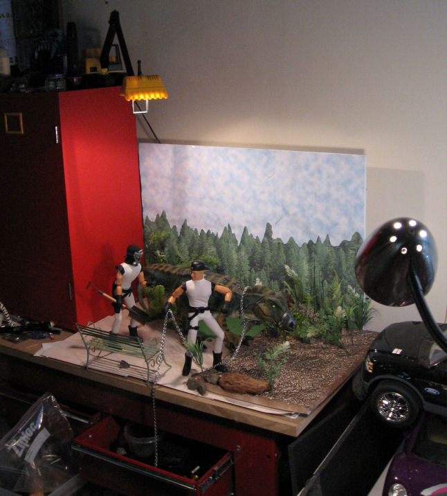
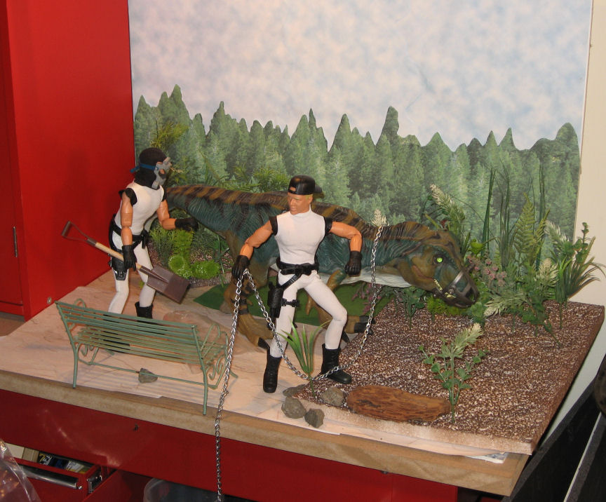
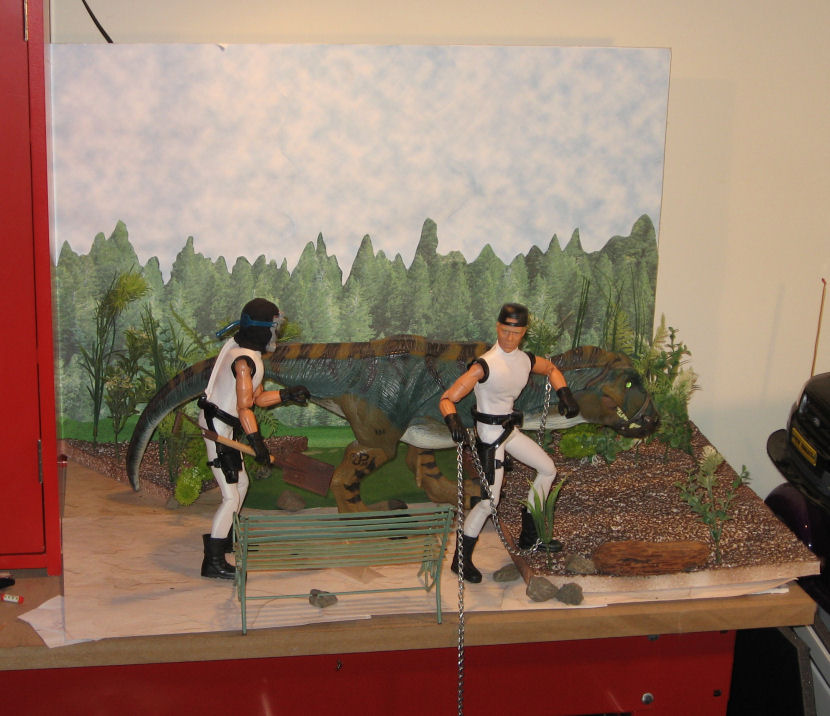
I'm really pleased with how this installment of "Minions," titled "Walking the Dinosaur" turned out visually, so here are some "behind the scenes" shots of the set.

I made extensive use of printed papers sold in craft stores for scrapbooking in this set. The ground is simply overlapping sheets of a "stucco" print. There are also some small scraps of a "grass" print to break up the lines. The backdrop is a cut-and-paste job onto a sheet of foamcore, using pieces of two different sheets, a "cloudy sky" sheet, and a "pine forest" pattern. I covered most of the sky with overlapping sheets of the sky pattern, then filled in the horizon with hand-cut pieces from the "forest" sheets. I probably used about four sheets of each.

The "dirt" area is actually a sheet of scrap packing foam hit with brown spray paint. I didn't use foam-safe paint, so it melted the surface into an irregular texture, and bits of white foam are showing up through the foam. I wasn't sure how it would work, but seen from the side, the white actually breaks up the dark brown and makes it look more like a natural ground-cover.

The plants are all plastic, consisting of bits of aquarium plants (bought cheap at a thrift store), and some dollar-store mixed greenery that I took apart to make smaller plants. The rocks are just some driveway gravel I picked up right outside my office door. The brown "log" is actually a piece of driftwood, the only real plant mater in the shot.

The park bench is metal. I found it in a thrift store (in metal housewares, not in toys) for about two bucks. The shovel is a craft-store item. The chain was purchased by the foot at the hardware store. The dinosaur is a "Jurassic Park" T-Rex, possibly one of the nicest toy dinosaurs ever made. I currently own three of them, and I'm always keeping my eyes open for more.

I did do a slight bit of digital retouching in Paint Shop Pro, using the "clone" tool to hide the edges of the foam sheet, and the "smear" tool to break up the edges of my cut-out trees and make them look more realistic.

The whole thing only took me twenty minutes or so to set up using things I had on-hand. I pays to think ahead and stockpile basic backgrounds and props like these.

Tuesday, July 04, 2006

Cut and Paste

Astro-Dan has been posting a series of figures computer blended into historic photo backgrounds, and over on the Sandbox we've been discussing tips for realistically blending a figure with the background. This is more art than science, and requires supplying the eye with cues that trick it into thinking the overlaid foreground is part of the photo background. You could write a book about it, but here are a few tips from this non-expert:

1: Match the shadows and light sources. The eye and brain are really good in picking up these cues, especially in photos, where this is how we judge the depth and size of the objects in the 2D picture. At the very least, try to match the primary light source.

Look at your figure. Where are the shadows on the face? If they're on the left, the light source is on the right. If they're on the right, the light source is on the left. If they're under the brows, nose, and chin, then the light is coming from above. This should match your background photo as close as possible. If there are no distinct shadows, or the shadows aren't pronounced, then the light on the figure is diffuse. If there are strong shadows in your background, it won't match.

One trick that sometimes works: if your figure has the light source on one side, and the background has the light on the other, its sometimes possible to flip one or the other (mirror image) and make it match. Obviously this doesn't work if there's something in the image to establish the "handedness" of the image. Any flipped writing will be backwards. Car steering wheels will be on the wrong side (but hey, we could be in England!). And Joe's scar could be on the wrong cheek!

2: Match the contrast of the background. Nothing will give away a "paste job" faster than a high-contrast figure against a washed-out background shot. Your photo editing software will probably have a brightness and contrast tool. It may have other brightness tools that are even more powerful (though they can be more difficult to figure out and use).

3: Match the color tone. Figure photos taken inside under incandescent lights are often "warm" in color tone. Fluorescent light sometimes results in a greenish tone. Photos taken outside under sunlight usually have a bluish tone. Your photo editing software probably has tools to fix this.

4. Match the color saturation. Modern photos taken under artificial light often have bright, over-saturated, colors. Historic photos taken outside often have muted, washed-out colors. Foreground should match background.

5. Match size and perspective. It's pretty basic that things that are closer are bigger, and that things which are farther away look smaller. In a photo scene, things contract towards an imaginary "vanishing point," which (on a flat plain, anyway) will lie along the horizon.

I could go into a big, not very informed lecture about perspective here. Trust it to say that your eyes and brain judge the size and distance of an object in a picture by its position in the picture in relation to other objects.


Take a look at this example I whipped up. The lines on the football field converge on our "vanishing point," illustrated with the red lines converging on the (hidden) horizon). On the left, I've arranged four figures positioned to appear the same height, even though each is about 20% smaller than the next. Note that as they stand on a line towards the vanishing point, another such line connects the tops of all their heads. Yes, I know that they look about 12-feet tall, but they ALL look 12-feet tall. That's what's important.

Now look at the figures standing along a similar line on the right. Believe it or not, these are the SAME four figures. I've just reversed the order. The monster standing back-rightis EXACTLY the same size as the more normal-looking guy standing front-left. The tiny shrimp front right is EXACTLY the same size as the fellow back left.

Likewise, any figure you paste into a photo background has to relate properly to the objects around them, or they're going to appear to be a giant, or a shrimp, or just hanging in the air in front of a distant scene, or worst of all, just pasted on a flat background like a stamp on an envelope.

Experiment with size and position relative to the background, and trust your eye on this. One trick I find useful is to look at the figure's feet. Though the imaginary plain leading off to the horizon may be flat, to your eye it SEEMS steeper as it's closer to the observer, and flatter towards the horizon. If you're looking down at the tops of a figure's feet, then it probably belongs close to the front of your image. If that makes him look gigantic, then he needs to be made slower. If, on the other hand, you seem to be looking at the sides of the shoes straight-on, then he belongs off in the distance, and should be positioned and resized accordingly. Use people, doorways, and other such details as reference in positioning your foreground picture.

Notice how the giant on the right rear seems to be up on his toes, about to topple forward, or to launch himself into the sky. That's a foot position cue at work. He needs to be closer to the bottom front of the picture.


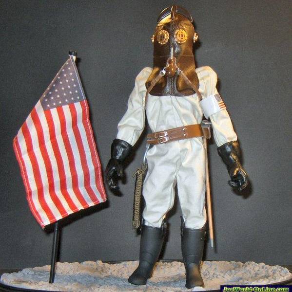
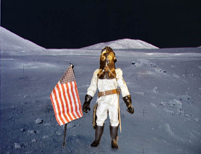
Okay, this is a quick example of putting these rules into practice, hijacking one of Dan's own images, his 1912 lunar astronaut. I've dug a NASA lunar photo out of my files and added him in.

This first example is done wrong. First of all, the position of the figure is wrong. He's too close to the front, and seems to be tipping backwards on his heels. One would expect light on the moon to be bluish and colors somewhat subdued. Instead, the figure is very saturated, and the colors warm. At best, he looks like he's standing in front of a photo backdrop. At worst, it's the stamp and envelope effect.

Now this next one isn't perfect, but it's not bad. I've cooled off the colors in the figure, increased the contrast, and reduced the color saturation, to make him fit with the background better. A couple of additional tricks. I added some blotchy shadows under his feet and to the right of him and the flag. These don't exactly match either the sharp shadows on his suit, of the washed-own and almost shadow-free background, but they do help to "ground" him in the scene. One other little trick, I copied a rock from the background (and reshaped it a bit, but that isn't necessary) and put in in FRONT of the toe of one of his boots. Again, that helps to "stick" him to the scene.

Again, though the figure in the "bad" image seems bigger, it's exactly the same size relative to the background as the "good" image.

This post really just scratches the surface, but hopefully it will provide some useful tips to apply in creating your own photos.

Monday, June 12, 2006

More Minions Extras

Okay, life and Minions have been keeping me busy enough that I haven't posted here in FOREVER. Here's a little Minions DVD extra from the current panel. If you haven't already seen the strip, I suggest you go check it out here before continuing.

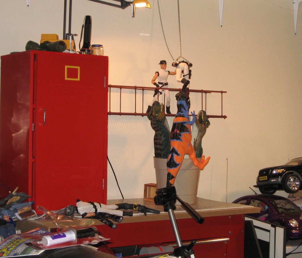
This week's setup guest-stars three "Jurassic Park" T-Rexes. Actually, to be technical, two are "Jurassic Park," and the third is a lurid repaint from the "Mutations" line. While these are sub-scale for 12" figures, they're still plenty big enough to photograph well with them and look plenty scary.

My problem was how to get them posed the way I wanted. These are fantastic, very realistic, soft vinyl figures, but they have no articulation at all. They're rubbery statues. So how to get THREE of them standing up and snapping at my poor Minion's heels?

I tried various ways of interlocking their feet to create a kind of tripod. Didn't work. I tried propping them up with boxes, or holding their tails with spring clamps. Didn't work. Finally, I went out the back door of the office into my sun-porch and found a large, unused, flower pot. By folding the flexible tails on two of them and jamming them in, then hanging the third over the edge and propping up one foot with a box, I got more or less the look I wanted.


Otherwise, this is a very simple setup, and the first appearance of my new "catwalk" set-piece. It's supported on a couple of mailing tube covered with a stone-pattern self-adhesive contact paper. The chain came from the hardware store, along with all the goodies to build the catwalk. I think, actually, that the catwalk deserves its own post...

Thursday, May 11, 2006

What, me post?

I haven't been posting here a lot lately, in part because I've been busy working on Minions for Hire shoots. Of course, I have some behind-the-scenes shots, but since these shoots are for toons that won't be posted for a while yet (I'm trying to hold myself to posting one a week under normal circumstances, in hopes that I'll build up enough of a backlog so I can pull it off like clockwork) I don't want to spoil the toons by posting the back-stage stuff yet. So look for some Minions DVD-extras here on Monday.

The requirements of Minions are inspiring me to create some stock sets and props that you'll probably see over and over as time goes by. Of course, you've already seen the cell-door I built, but there will be others. A major one I'm working on right now is an industrial-looking cat-walk with an open-grid floor.

The catwalk is something I've been meaning to do for a long time. I'm building it around an extruded and stamped plastic screen designed to keep leaves out of gutters. The stuff comes in three-foot sections, and so I'll build a three foot section of catwalk that can be suspended over a set, or used as a setting itself. The plastic screen will be shored up with strips of flat, rectangular molding attached to the side with screws and nuts, and by the hand-rails uprights, which I plan to make from sections of threaded rod.

I'm hoping the final result will be generic enough to look at home in a super-villain lair, a factory, a refinery, or a rocket gantry. If you've ever watched a James Bond movie, you know there are always Minions in the catwalks, where they have spectacular fist-fights with the heroes, be shot and fall over the railing, or just be blown off by explosions. I think I can get a lot of use out of this little prop. I'll post some construction photos, and hopefully this is something that anyone with access to a hardware store and a few hand-tools will easily be able to replicate.

One important development here is that I've replaced my trusty Canon Powershot A40 with a new Canon Powershot A530. It's smaller lighter, has more shooting modes, better movie function, a 4X optical zoom instead of 3X, and most importantly, 5 megapixels instead of 2. I've been very happy with the Canon Powershot family of digital cameras, and I recommend them highly. They take good pictures, and have a lot of control and versatility for compact cameras. I've been impressed with the quality of the optics, the image sensors, and the all-important software that backs the sensor up. They take good pictures. 'Nuff said.

The old camera still works great, and I'll pass it off to my daughter so she has a decent camera to photograph merchandise for her web-store (she does sewing and costume work). 2 megapixels is more than enough for typical web-ad photos.

Meanwhile, to fill the time until I can post some new stuff, here's a golden oldie in honor of the coming summer, to remind you to always wear your bug-lotion.

Tuesday, April 11, 2006

Talk about lighting

There's been some discussion over on the Sandbox lately about photo lighting, prompted by a photo-lighting article in the magazine Fine Scale Modeler. Their techniques emphasize seamless backdrops and defuse lighting. My take was that while this technique works well enough and shows well the details of whatever you're photographing, Joe-photos often benefit from more dramatic lighting.

One friend e-mailed to tell me that the FSM techniques were used by the "Twisted Toyfair Theater" feature in Toyfair magazine. Good enough. But those features are played for broad comedy and emphasize that the things being photographed are toys.

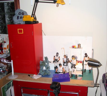
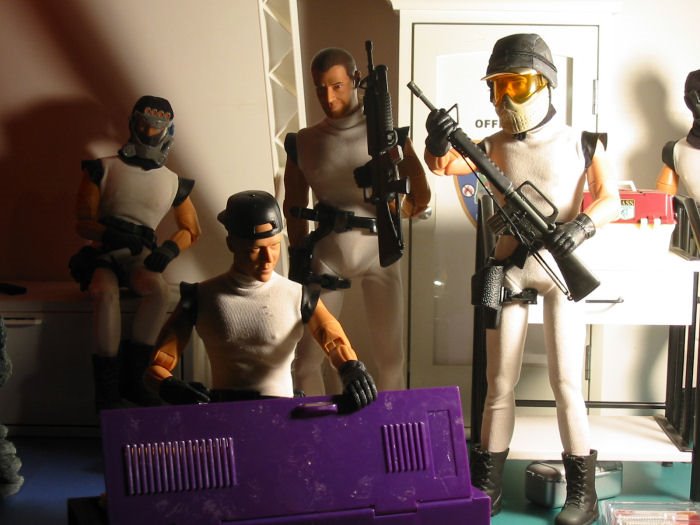
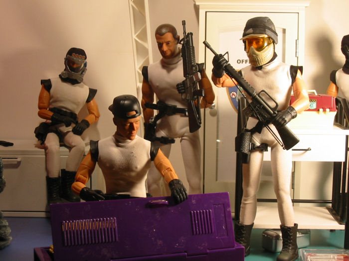
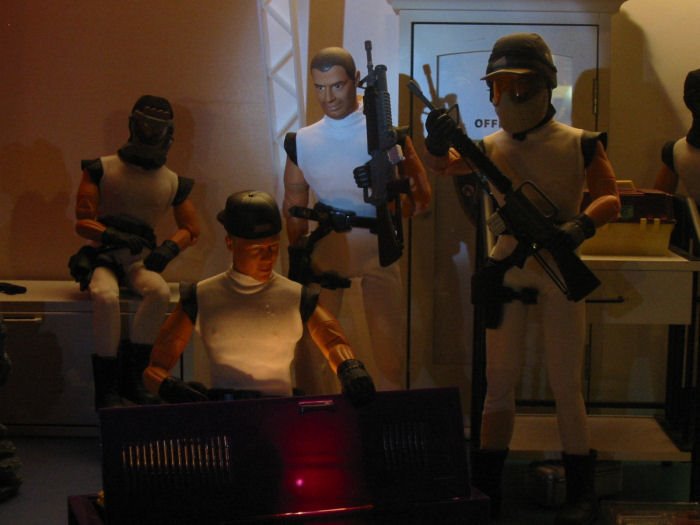
Different lighting techniques can increase realism and enhance mood. To illustrate, I set up some very quick examples of how lighting can greatly change the mood of the shot. I set up a random assembly of my "Minions" figures and some props. (Actually, most of them were already there. I just removed a few things and reposed the figures a bit.)


This first shot shows the setup on my bench. There are two main light-sources, a high-intensity arm lamp on top of the cabinet to the left (yes, it looks like a back-hoe) and a small incandescent (60w) goose-neck lamp clamped to the table. The lights are on in this shot, but largely washed out by the on-camera flash.


The flash was turned off for most of these shots, as here. You'll see why we turned off the flash in a minute. Since my lighting sources aren't very bright, all of these shots are long exposures (which my Powershot A40 handles very well, though not all digital cameras). For that reason, I used a solid tripod and a ten-second shutter delay (so as to avoid camera-shake when I pressed the button). I like time exposures, as they keep the lights low-power and low heat. They also allow for some nifty tricks if you know what you're doing.

As for camera settings, other than the things I've mentioned (flash-off, shutter-delay), I let it handle its own exposure settings. It does a good job, though you could get different results by fiddling with them manually.


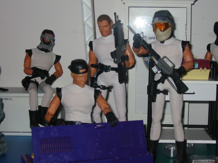
This first example simply uses the on-camera flash. Note that the lighting is very flat, in more ways than one. There's no sense of depth here. The background could be right behind the front characters instead of the foot or so that it really is. There's no texture in the uniforms, and the faces look plastic and artificial. There's also a reflected flare off the glass door in the background. Though you could use something like that as an effect, it's generally not something you want.


This next shot uses only the high-intensity arm-light, located above and behind the main-figures. This gives us a strong back-light with a lot of soft fill reflected off the white wall and props.

You can see there's a huge difference. Suddenly we have depth. The shadows and reflections make things "pop" as 3-D, and add plenty of drama. Trouble is, the HI light is harsh, making plastic look like plastic, and the position leaves faces in shadow. Maybe we want them in shadow, if these are supposed to be anonymous folks skulking about, but let's say we want to put emphasis on them as characters.

We'll get to that in a minute, but one more thing about this. Notice how the strong "light of god" attracts your attention up to the source of the light. Is there a hole blown in the roof? Is there a helicopter up there? There's a feeling that what's really important here is somewhere else, off-camera. Again, if that's what you want to do, great. If not...


This shot uses only the clip lamp on the right of the bench. Again, depth. Again, dramatic. But this is totally different.

The incandescent bulb is more defuse and warmer than the HI light, making the plastic look less plastic. The faces are not only lit, but the dramatic shadows really add depth, mood, and character to the faces.

Because the light is close and bright though, it "blooms-out" on the right of the picture. It draws your attention, but less-so that the overhead light because your eye is drawn to those faces. Notice too how the angle of the light really brings out the textures in the uniforms and adds to the realism.


Now we start mixing light-sources. We're still using the clip-light on the right, but now I've turned the overhead HI light on and turned it to shine on the white wall behind it and a white shelf-overhead. The result is a dim, soft, fill-light that is mainly visible in the background and in the shadowed areas.

Notice that the figure in the background suddenly seems more important, and what they guys in the foreground are doing, less-so. It's much less spooky, but this shot still has nice texture and depth. If you were playing for comedy or casual drama, this might be a good setup.


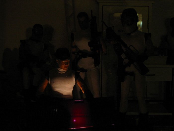
Now we're going to play with two other light sources that I haven't mentioned yet. Here's the first one, a small (two AA cell) incandescent lantern-type emergency light hidden behind the door of the locker. Basically it's a bare bulb with a tiny bit of diffusion. There's also a tiny bit of fill light on the background here, basically reflected lights from the dimly-lit office. The bit of greenish light in the upper right quadrant of the picture is the far wall of the office reflected in that glass door.

Obviously, this puts all the emphasis on the figure opening the locker, though there's just enough light to show you that there are things and people around him.

This is part of why I like time exposure. A light like my little lantern would likely be way too dim for a normal hand-held snapshot.


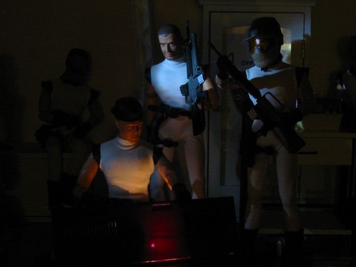
Now we add one more new light-source, a small single-LED flashlight. It provides a somewhat focused circle of bluish light that suggests it could be coming from an in-the-scene light source, such as a flashlight or spotlight, invisible just off camera.

The flashlight is actually near the camera and just to the side, so the lighting is rather flat. By aiming it low, it reveals the figures behind without drawing undue attention to them (the faces are in shadow).


Here's the LED flashlight again, but this time I've moved it off to one side for more dramatic shadows, and aimed it at the face of one of the figures standing behind the lead-Minion. Again, the emphasis shifts to him watching. Is he delighted at what he sees? Alarmed? Is he planning to steal it? Clearly, something is up. The lighting says so.


Finally, we add a soft bounce-fill from the overhead light to the previous elements. The emphasis is still on the two foreground characters, but we're aware of their surroundings (which are far less frightening) and the people around them. Still moody, but far less sense of dread. One nice touch is the variety of colors provided by the different light-sources, though all are what you'd think of as "white" in other circumstances.

So there you go, a lot of different results using some pretty simple equipment that most anyone would have around. This isn't intended to be an instructional feature, just some examples that my inspire you to experiment on your own.

Saturday, December 10, 2005

Fallback position


Hey, Steve, here's an idea. On a day when you're busy and don't have anything cooler to post, put up a picture of one of your cats messing up a 1/6th photo shoot.

Good idea, Steve, I'll do that. Here's a picture of Banzai invading my Adventure Team headquarters set.

Oh, right Steve, I remember that. He managed to walk all through it, and not knock over a thing.

Come on, Steve, he was having an off-day. Go easy on him, dude.

Right, Steve.

Right.

Wednesday, November 30, 2005

Big Bird

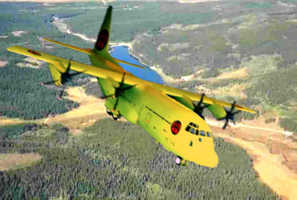
I mean, what else would you call a big yellow C-130 Hercules? This is one of my more unusual photo edits, in that there aren't any 1/6th items in it at all.

I started wondering, how does the Adventure Team deploy all those vehicles and fuzzy-headed guys all over the world? Obviously they'd have a transport aircraft of some sort, but what would it look like? This is my attempt to answer those quesitons.

No idea where I got the base shots. I'm not even sure if it's a real plane or a model. I was relatively new at doing sophisticated photo editing when I did this, and I could doubtless do better now. The green shadows and the too-dark tail don't look quite right. (Must be flying through the shadow of a cloud. Yeah, that's the ticket.) Still, fairly cool.

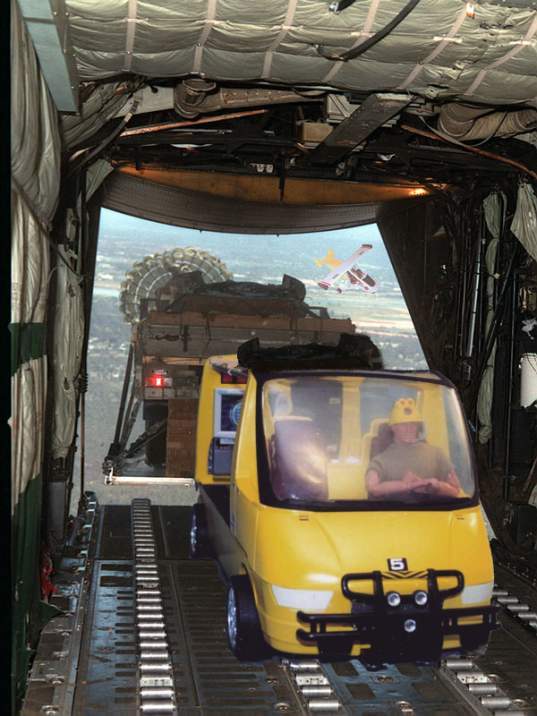
But then you start to wonder, what's in the plane? I had to look around quite a bit to find this base shot of vehicles being air-dropped, and then I used an existing shot of my custom MLV (Mobile Logistics Vehicle). I think it's a little undersized, but as I recall, I had to do it this way to make the perspective work.


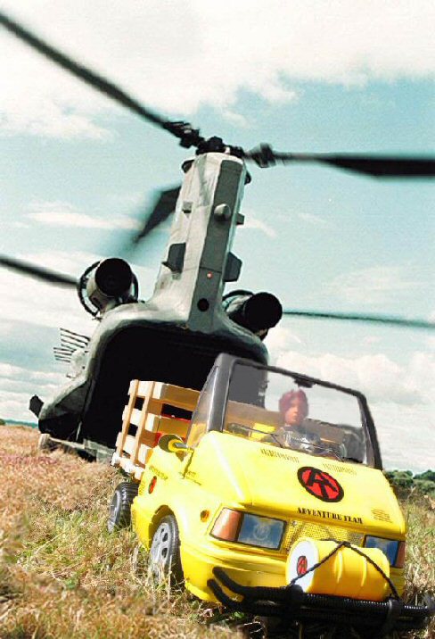
Finally, my favorite of this bunch of photo edited shots. It really looks like I took my custom LMUTT mini-truck and plopped it down on the ground behind a Chinook helicopter. It's difficult to tell where the grass in the base shot stops, and the grass in my front yard starts. Stretched out, this makes a pretty cool desktop.

Hmm, I suppose I could have tried to make the Chinook yellow, but that's taking "flying banana" way too literally.

So, now you know more than you wanted to about AT air-deployment. "The Adventure Team is needed..."

...well, somewhere far away.

Tuesday, November 29, 2005

Hang in there


It's about midnight here, and time to post another picture. Here's one more from the archives, a favorite photo edit.

The figure in the foreground is an Adventure Team dinosaur hunter I kitbashed a while back named Scotty Travis.

The location here is actually a roadside along Highway 101 just north of Newport, Oregon. The "cliff" here actually isn't rock, it's just packed, sandy, soil, cut away by road workers. The distant cliff behind the helicopter is actually only a few feet from the figure, but it gives a pretty good illusion of distance. The 21st Century Toys rescue helicopter was actually shot in my office, and added to the scene later using Paint Shop Pro.

By the way, with any of the pictures here, the small shot in the message is only a thumbnail. Just click on the picture to see it full-sized.