Tuesday, February 06, 2007

Houston, we have winner.


We're going to stray from our 1/6th mantra today.

Besides GI Joe and other 12" action figures like the Marx Mike Hazard and Captain Action, one of my favorite toys as a kid was Major Matt Mason. For those who aren't familiar with Matt's short but glorious run, he was a 6" bendy astronaut with removable helmet. The figure was fine, but what made the line so great were Matt's huge range of accessories, from nifty bubble-carded playsets to huge battery operated Moon vehicles, a working space glider, and the grandaddy of the line, a three level "space station" that stood several feet tall. He also had a number of astronaut friends (including an early black action figure, though GI Joe apparently had the first), and several aliens.

I've got a more-or-less complete space station in my collection, a space crawler, a few replica figures and a few smaller accessories, but this stuff is spendier and harder to come by than GI Joe stuff, so I've never tried to amass a full collection. But I do follow several discussion lists for MMM collectors, and there's always discussion about Mattel reviving the Matt Mason line in some form, either as a replica of the original toy, as a new toy line, or both.

Of course, with old-time collectors the sentiment is on a new bendy toy. And while that's possible for a nostalgia replica, I doubt it would happen with a new toy line. (Given modern safety laws, it might even be impossible for it to happen.) On the other hand, people seem opposed to the idea of a hard-plastic figure. Maybe one feeling is that it won't be realistic enough, or more probably, that it will lack articulation.

Well, in that department, I think the original Matt is somewhat overrated. His waist, wrists, and ankles didn't bend (though the ability to twist the leg somewhat compensated for the last), and his "bellows" knee, elbow, shoulder and hip joints couldn't hold a tight bend very well. He couldn't sit well, or bend well, or do much of anything well but stand there with limited bending of his arms.

The original had other problems as well. Those wires always broke eventually, and they could break sooner if the figure was dropped or flexed too hard. The rubber had a tendency to "melt" in the hard plastic of his accessories (try finding a space station seat without melt marks), and his paint peeled off.

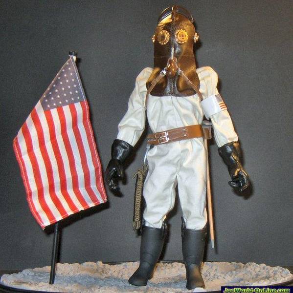
Fortunately, modern toy designers have other options, and I think nothing illustrates this better than the above pictured figure. Surprisingly, it's from the second series of Fantastic Four movie figures. It's the "Astronaut Ben Grimm" figure. (You can click on all these pictures for a closer look).


Like Major Matt Mason, this is a roughly 6" astronaut figure. Like Matt, the design is closely based on real space suit designs (this closely resembles hard suits planned for future Mars and Moon missions) and seems to include the rear-entry hatch design used in current Russian suits). But there, the comparison ends.

This is a hard plastic figure, and unlike MMM, this faithfully represents the bulky look of actual EVA space suits from Apollo forward. As such, you'd think the articulation on this figure would be very limited. You'd be wrong.


This guy is very limber. He has ball and socket joints at hips and shoulders with a large range of movement. The knees are double jointed so the legs can bend almost double. The elbows only bend about 90 degrees, but that's probably as good as Matt could do, and he also has a hinged wrist (no rotation, unfortunately, though there's no reason a similar figure couldn't have this designed in), and hinged fingers for grasping. His waist swivels, and his feet not only bend back and forth, but have hinged toes for kneeling, and swivel from side to side to allow him to stand flat-footed in a variety of poses or on irregular terrain.


In addition, there are also rotary cut joints at the upper arms and legs, giving him even more flexibility. He can be posed walking. He can kneel. He can jump. He can dance. He can float He can sit, though not bolt upright with his knees close together. His poses are very natural and life-like, not stiff and robotic.

He can touch the top of his helmet, and hold things in front of his faceplate.

Heck, he can even scratch his butt (those space diapers they have to wear are itchy!).

With all this, he still has an "action feature" built in. Press the button on his backpack, and his head spins around in his helmet, changing from a human face ("look, it's that guy from 'The Shield!'") to a rocky "Thing" face. Of course the action feature means his helmet and backpack aren't removable, nor can the head turn in the conventional way. But these features could certainly be built into a purpose-built modern astronaut figure.

With all this, Astronaut Grimm seems to be a solid, sturdy, playable toy that I wouldn't hesitate to give to a younger child.

If you like space toys, this little baby belongs in your collection, even if it is (no pun intended) a stand-alone piece. These came out a long while back, but I've seen them in KB Liquidator stores not to long ago, and given the wide distribution of the FF toys, you never know what drug store of Big Lots might have one of these warming the pegs.

But the bigger point is, it is possible to do a good astronaut figure using modern hard-plastic construction, one that would be a worthy heir to our beloved bendy Matt.

Thursday, February 01, 2007

How Big is your Image File?

Okay, not intended to be a personal question. Over on one of the Yahoogroups I frequent, Power Team, there's been a discussion related to the groups filled-up photo albums, and what to do about it. I made the statement that most people don't care to learn the technicalities of managing the size of their image files. Somebody called me on it, so here I am, giving you a chance to learn a little more about this esoteric subject, if you're interested.

Fact is, the issue of image sizes is often counter-intuitive. We're used to "megapixels" as marketing speak, but most of us have very little idea how images are stored in our cameras (and in turn on our computers), or why a picture from one 6-megapixel camera can look much better than another 6-megapixel camera.

Okay, I don't intend to get side-tracked into a camera discussion, but if you follow and understand what I tell you here, it does apply to your camera and may help you better understand how to use its features.

I'll try to keep things simple and non-technical, and that means (for you techheads out there) that I may make some simplifications and generalizations about things. Just relax and cut me some slack. If what I say here isn't always absolutely true, most of the time it's true enough.

As I said, the number of pixels that a camera can detect doesn't always translate into a better image. Likewise, two images on your computer of the same absolute size (say 800 pixels wide, and 600 pixels tall) may have much different file sizes. In both cases, the major issue is something called file compression.

Okay, you've probably noticed in one way or another that image files take up a lot of memory (space on your camera's memory card, space on your hard disk, and so on). What you maybe don't know is that it could be much worse. Almost every image on your computer and in your camera uses some form of compression to make it smaller than it would be otherwise.

What is an image file?
To understand how an image file is compressed, you need to understand first what an image file is.

I used the word "pixel" back there and took it for granted that you'd know what I was talking about, but I'm not sure that's a safe assumption. In general terms, a pixel is a dot. Each dot has characteristics of color and brightness that are recorded in digital form (those ones and zeros you keep hearing about, which can be ignored for our purposes) on your camera or computer. Depending on the type of file and the options chosen, various amounts of information can be stored for each pixel.

The simplest kind of image just has two conditions for the pixel, on (white for instance) and off (which could represent black). But in this day and age, it's rare to see an image that doesn't have color. Some images have just a few colors available. Most photos have a LOT.

Think of it as box of crayons. If you have a box of eight crayons, you're pretty limited in how realistic a picture you can draw. If you have 256 crayons, you'd be able to draw a better picture. Well, many of the images you have on your computer have tens of thousands of crayons to chose from, and most images will use a fair percentage of those. The more crayons you've got, the more information has to be recorded to show which crayon is used to draw any given pixel.

So in basic terms, an image file is something like this.

Pixel 1 (Starting in the upper left hand corner): Pixel 1 is color 11,320 from our box of about 32,000.

Pixel 2 (the next pixel in the top row, but one to the right of pixel 1): Pixel 2 is color 11,321 from our box of about 32,000.

And so on, repeated (in our 800 x 600 example image) 800 times, until we skip down to the left of the second row, and repeat, the whole process repeating 600 times until you reach the bottom right of the picture.

So in a raw, uncompressed file, file size is pretty simple. It's the amount of space each pixel takes up multiplied by the number of pixels. Two pictures of the same size will be the same size, no matter if one is of a blank, white, wall, and the other is of a forest. That's simple, but it's wasteful of storage space, and as I said, image files are inconveniently large. Anything we can do to make them smaller is a good thing. But how do you make the file smaller, without making the image itself smaller?

Squeezing it Down
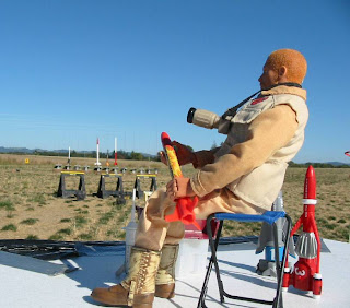
The funny thing about pictures is that, while a picture may have a lot of pixels, in many images a lot of those pixels are in patches that are exactly the same, and if they aren't the same, they're darned similar. For example, image a picture of your favorite GI Joe sitting on a table outside. Below him is grass and other "ground clutter," but behind him is a clear, blue sky.

Imagine looking at a pixel in the middle of that sky. Let's just call it's color, "blue." Maybe the next pixel to the left is the same blue, and the one beyond that just a TINY bit lighter blue, and the next beyond that back to the original blue again. In fact, you could go a fair distance in any direction from our pixel, and no be able to find a color that was much different than that original pixel.

Sure, some of them are different, but most are so close that they're difficult or impossible to tell apart with the naked eye. If you can't tell them apart, then the computer (or camera) is wasting a lot of space storing information that really doesn't serve much of any purpose. A computer (or the software built into a camera) could look at those similar colors and decide they were too close to tell apart, and set them all to one, average color.

Having turned a bunch of almost identical colors into really identical colors, imagine that, instead of storing "pixel 1, pixel 2, pixel 3" we could instead store "starting 100 pixels from the left and 120 pixels down there's a rectangle. It's 150 pixes tall and 500 pixels wide, and all those pixels are color 11,320 of around 32,000, AKA 'blue.'" We just defined 50,000 color pixels with one sentence. In computer terms, we just saved a butt-load of storage space.

Okay, now imagine the software takes your entire picture and divides it into a whole bunch of rectangles, and defines each one in the same way. Some of those rectangles, say a piece of blue sky, or a white-washed wall, or the big yellow side of the Mobile Support Vehicle may be pretty large, and defining them will save a ton of space.

But other rectangles will be smaller, say the skin on a cheek between the eye and the crease around somebodies mouth, or the middle part of an orange on a table, or the white in a little patch of cloud floating in that blue sky. Defining those areas will still save space, but not nearly so much. It may take just as much storage space to define an area 10 x 50 pixels as it does for one 100 x 500. Some places on the image, in a bed of gravel, or a patch of grass, or in the leaves of a tree, or in uncle jack's herringbone sports-jacket, the rectangles may get so small that it isn't worth making them at all. You'll do just as well to record the individual pixels.
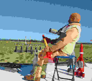


It's easier to see how this works if you look at an image that's been over-compressed to the point of looking "jaggy." Like this one. You might want to click on it for a closer look. Notice that a blue sky isn't just ONE shade of blue. There may be hundreds of shades in the original image. But maybe you can turn it into ten or twenty shades, and your eye usually won't notice. Even in our super-compressed example here, there are still four bands of different blue in the sky, but obviously you do notice.

Notice the smaller blocky areas of the same color, the parts of his uniform, the table he's sitting on. Then look at the really "noisy" parts of the image, the grass, his his detailed boots, the rocket launch pads in the background. Of the total image size here, very little of it is that blue sky, or the white table top. Most of it is in those "dirty" areas. Life is in the details. So is file size.

Most cameras, and most photo editing programs on your computer will somewhere have options on how aggressively to compress images. More compression lowers quality, until you eventually get the "paint-by-numbers" mess you see above, but less compression means bigger file sizes. There's a happy sweet spot somewhere that you can live with. Generally, I go for less compression on the camera, but more compression when I save things for uploading from my photo-editing software (Paint Shop Pro, in my case). As long as you keep the original, high-quality images from your camera, you can then create all the cropped and compressed copies you need. The original is still there if you ever need it.


Dirty Details

So compact image sizes start in what you're taking pictures of. That doesn't mean you should never take a picture with grass or a tree (or your rough concrete driveway, or your hardwood floor). If that's part of what your picture is about, then do it. It's hard for the Adventure Team to have a jungle adventure without the jungle, for example.

But if, on the other hand, you're taking a picture of something to sell on EBay, you may not want to photograph it against you pin-striped sheets or sitting on top of your jelly-bean collection, because that isn't what the picture is about. All that clutter in the background is just wasted file space.

Bringing in the Crops
One easy way to reduce the file size of images before you upload them is to crop unnecessary stuff from the edges. Figure out what the picture is about, and cut off the rest. Yes, a well composed image is going to leave some open space around the subject, but when in doubt, crop.

The point here is not just to make the dimensions of the image smaller, though you'll probably do that. The point is that often the most "noisy" parts of an image (and thus the hardest to compress) are on the edges. For instance, in a picture of an action figures standing in the back yard, do you really need all that grass on the bottom of the picture? It's kind of a law of nature. Gravity pulls clutter down to the bottom of the picture. Nature grows it up on the edges (plants, trees, mountains), and the atmosphere sometimes tosses it in at the top (clouds). The action figure or vehicle in the middle of the picture may be the easiest thing in the frame to compress. Cut off ten percent of the grass at the bottom, and you cut off thirty percent of the file size.

Size Does Still Matter
I said that image size was not the biggest consideration to file size, but it is still a consideration. Just because your camera can record 5 megapixels doesn't mean you necessarily need to share them all with the world. In fact, if the intent is for people to look at it on their screen, the vast majority of that information is just going to be wasted.

If you learn nothing else, learn how to use your photo editing software to resize your images. Remember that you'll probably want to save the reduced-size image as a separate file, and keep your camera original untouched. Once you lose that information by saving a downsized image, you can't get it back. Yes, your paint program can resize the smaller image back to the original size, but it will end up looking like our blocky example about, and not your beautiful original.

How big should your images be? Well, probably no bigger than your average viewer's screen, and probably not even that. Remember that most web browsers clutter up the screen with scroll bars, menu bars, and so on. You just get the smaller space left in the middle. I'd say that 800 x 600 is a good "big" image size, and that many images can be much smaller. Remember that if you've cropped your image as I said, many will be tall and skinny, and some will be short and wide. Just resize it so that the width is no more than about 800, and the height no more than about 600, and you're pretty safe. Much larger than that is wasted on most people's screens, unless you think they'll need to be able to zoom in to view details for some reason (as might be the case in a "how-to" illustration, for example).

Reducing the size of the image, even a little, can be more important than you think. The information that makes up an image grows much faster than the linear dimensions do. For example, a raw 500x400 image doesn't have twice as much information in at as one 250 by 200, it has four times as much. A 1000 x 800 image has 16 times as much information as one 250 x 200, and so on. Compression can offset that to some extent, and usually does, but when you can, smaller is better.

When creating web pages, a common mistake is to confuse options in your web editing software that set display sizes for actually resizing the image. That is to say, somebody will upload a 5 megapixel camera image to their web site, and then tell their web-page editor to display it as a 100 x 200 pixel image on the user's screen. But they're still storing the full 5 megapixel image on their site, and every user who views the site his to download that huge file (with the bandwidth use that goes with it), even though it only displays as a tiny picture on their computer.

Always resize the image using a photo editor program to the final size, then upload that file to your web page.


Goes Down Smooth (for advanced users)

One other trick to reduce image file sizes is to remove some of the random noise that appears in images. Some of this noise can come from "grain" in the image. Noise like that can turn an empty sky or a solid color wall into a compression nightmare, but not add much of anything to the image. Likewise, all those pores and tiny wrinkles in your portrait are not only making you look old before your time, they're also making the image file way bigger.

One way to reduce this noise is simply to soften or blur the images, like when old Hollywood movies used soft-focus lenses to make aging actresses look better in close-ups. You can try this (usually using editing functions in your photo-editing software, not by changing camera focus), and there are sometime reasons to do it, but often this is throwing the baby out with the bath-water. You not only blur the solid areas of the image, but the lines and borders that separate them.

Some photo-editing programs have ways around this. For example, Paint Shop Pro has a function called an "edge preserving smooth." This effectively blurs the solid areas of an image that may contain useless noise, while keeping the lines and edges crisp and solid. It can take out your wrinkles and pores without turning your nose into a blob or your eyes into smudges. It can smooth the sand on a beach but still leave the ocean horizon a razor-sharp line.

The more creative among you may want to consider more labor-intensive methods, manually retouching parts of a picture, or selecting areas to blur or soften, but that's beyond the scope of the casual user making an average picture for upload.

As Big as it Needs to Be
Just remember that your images, and your image files, should be just as large as they need to be to show your subject and deliver your message, and no more. Beyond that, trim the fat. Cut clutter off the edges of the image. Resize the images to be just a big as it needs to be, and no larger. Consider reducing noise and clutter that add nothing to your picture. Set your compression settings enough to reduce the size of your files without detracting from your delivered image.

Doing these things will save disk space, cut upload times, cut download times, reduce bandwidth charges, and make your web pages load faster. They'll make both you, and the people viewing your images, happier, and what's not to like about that?

Saturday, January 20, 2007

A Fossil T-Rex for the Adventure Team


I've been so involved with the Minions lately, that I haven't had much time for my old friends the GI Joe Adventure Team. But today, while picking up a bag of cat food at Petco, I spotted this great T-Rex fossil skull in the aquarium department, and had to have it. I love 1/6th "artifacts" for the Adventure Team to dig up and bring back to the Adventure Team headquarters for display, and this is a doozie.

I always thought that Hasbro missed a bet not making AT "Dinosaur Hunter" figure sets, each of which would include a fossil skull or skeleton accessory for a kid to dig out of the sandbox. This gives you a pretty good idea of what I had in mind, though a toy version would obviously be made of lighter and more durable materials.


The skull is made of hard resin (heavy!) and has an air hose on the back that I'll cut off (even the tag is still attached in this photo). The top of the skull is hinged (so it can open and close as it fills with air). Price was about $10, and money well spent. Actually, big as it is, it STILL isn't full scale for an adult T-Rex skull, but I figure it's close enough.

It looks pretty good in the greenish-gray paint it came with, but I'm at least going to use some acrylic paint to darken the eye sockets, nostrils, and other openings in the skull. I'll post some more photos when I get around to it.

Monday, January 15, 2007

1/6th working engine hoist


I picked up this nifty cast-aluminum engine hoist with working hydralics at a Harbor Freight store. I've never seen it in their catalog or web page(though they have listed the 1/6th jack stands, mini-floor jack and 1/5th tool cart). I think it cost me about $15, which was shockingly cheap (the floor jack is closer to $30). It didn't come with a hook. Instead, there's a metal weight shaped like a tiny engine. I used some hardware store chain and an "S" hook from the same source to hook up my Lincoln Mint 1/6th Ford V-8. Seen here with a GI Joe Collector's Club "Foreign Adventurer" for scale.

Wednesday, January 10, 2007

Amazing 1/5th Scale Ferrari 250GTO


Been a while since I posted here. When I've had a few moments of Joe-time lately, I've been pretty busy with my weekly 1/6th photo-comic Minons at Work. If you haven't visited for a while, check it out. New cartoons every week, and we just opened a Cafe Press shop so you can buy Minions at Work shirts, mugs, and other gear.

But I just had a hole open up in my schedule, allowing me a little time to catch up some things. Last year we made a stop in Las Vegas and I got to do a little sight-seeing. While wandering through the Grand Canal shopping area of the Venetian Casino and Resort, I spotted this incredible near-Joe-sized Ferrari in a shop window and took a couple shots. It was late at night, and the shop was closed (things DO close in Las Vegas, despite what they tell you) so I couldn't see the price tag or description. My best guess based on the level of detail and craftsmanship was "if you have to ask, you can't afford it." From what I've been able to find out, that's close. Here are some more details here. 3,600 Euros folks, shipping NOT included. Still, it was cool to see.

Wednesday, August 23, 2006

Making an easy weapon-rack


Maybe you've seen those cool grid-type weapon racks in 1/1 size. If nothing else, you might have seen them in the ballistics lab set on CSI: Las Vegas. I've always liked those, and I even think that somebody (BBi or Hot Toyz maybe?) made a 1/6th version, but somehow I never ended up with one.

Now maybe you've heard about the concept of a "one-sixth eye." It developing the sense of looking at everything you see as a potential 1/6th prop, and evaluating it accordingly. The other day I was in my local Ace Hardware store looking around (while fending the over-helpful sales people off with a stick, as usual) when I spotted something in the paint department that sent my One-Sixth-O-Meter right to stop.

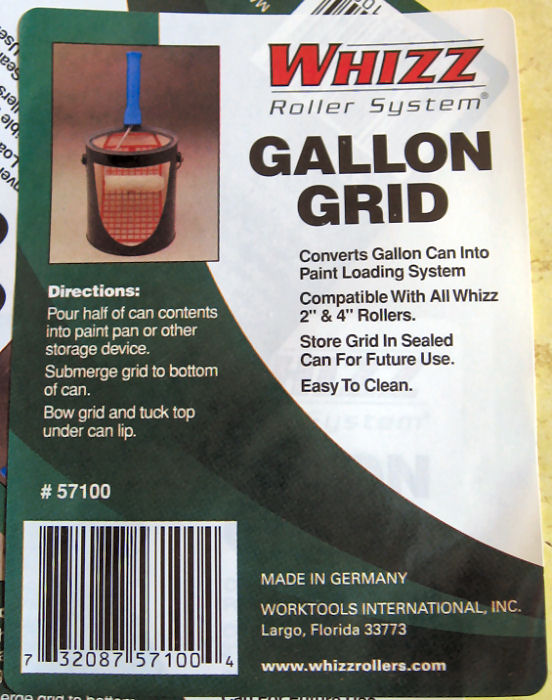
It was a cool little plastic grid molded in off-white speckled plastic, part of some sort of fancy roller system, the Whizz Roller System It wasn't even in a package. It was just a plastic grid with a sticker on it, hanging on a peg. Price: 99 cents. At first I couldn't be sure what it was good for, but I knew there would be something I could do with it. I almost bought just one, but on impulse, I picked up all four that they had in stock.

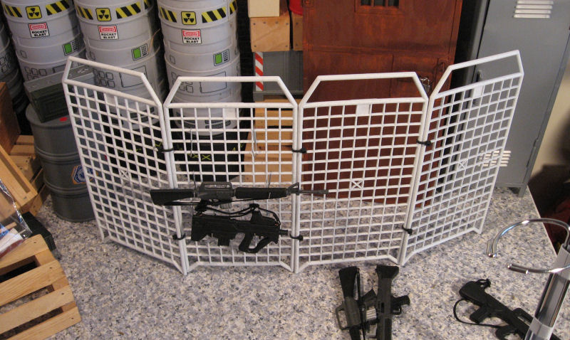
It didn't take me long to realize that they'd be interesting attached together edge-to-edge. I looked around for an easy way to do that, and ended up settling on small, black-plastic wire-ties that I already had on hand. I used two along each edge, pulled tight, and cut the excess off with scissors.

By now, I was starting to think weapon rack. My intent was to make a free-standing, four-sided rack, but for maximum flexibility as a prop, and for easy storage, I didn't tie the final corner together. That way, it could be folded into a square footprint, fanned out as a screen-type rack, or even be used as a safety or crowd-control fence.

The next issue was how to make hooks to hang weapons on the rack. Whatever I did had to be cheap and easy to mass produce. After several dead-end ideas, I settled on using light-duty, wire, paper clips. I used the inner loop of the clip intact, bent the larger loop out about 45-degrees, then cut it off (using wire cutting pliers) leaving about a half-inch stub, I then bent up the last eight of an inch or so using pliers, to make it more of a secure hook.

The small loop from the clip goes over the grid. The weapon itself hangs on the cut-off stub. (It occurs to me that another alternative that might work would be to use wire Christmas ornament hooks, and they'd probably work unmodified)


Here's the final result, with only a few weapons installed on one side. This would look equally at home in the firearms locker for an assault team, in a ballistics lab, a police property room, or an arms-dealer's show-room.

Friday, July 28, 2006

Tree how-to follow-up

I was gratified, and maybe a little surprised at all the positive feedback in email and many forums, you're only seeing a tiny fraction of it here) I've gotten on the "make a tree" post. Given all the quick-and-dirty set and prop building I'm doing for "Minions," you'll probably see more in the future. Please let me know what particular things you'd like to see, and what you like (or don't) about the posts I do make.

As always thanks for reading! (And viewing!)

Wednesday, July 26, 2006

Only God (and now you and me) can make a tree


In my photo dioramas I've been making lots of use of pre-printed papers sold in the scrapbooks sections of craft stores. I've successfully used them to represent grass, sand, brick walls, and even water. But after doing last week's park-scene for Minions, it got me thinking about other "stock" props I could build for future use.

One thing it occurred to me would be nice to have would be a bunch of tree trunks for forest scenes. Yes, you can use real wood, but the stuff is heavy, dirty, hard to store, and sometimes just doesn't look right. Maybe there was a better way.

I started to wonder if I could find a "bark" paper to use, but I trip to the craft store turned up nothing. Then I had another thought: why not print my own?

I used Google's handy image-search function (searching on "bark") to come up with a couple of likely source images. Then I picked my favorite and used Paint-shop Pro to "clone" the image three across to make it wider. Finally, I printed it on my inkjet printer using the "stretch to fit page" option. I printed three copies, to give me enough sheets to work with.

My thought was that I could glue them around cardboard tubes. Yes, they'd be smooth, but my experience is that realistic textures usually don't look flat to the 2-D eye of the camera. I figured if I just wrapped it around a tube or dowel, it would look good enough, especially if it appeared in the background of a scene.

This is the same trick that computer game makers use when they "map" a detailed texture onto a fairly simple 3-D object to achieve a realistic look without bogging down the computer or console rendering the scene. In this case, I was "mapping" the flat bark texture onto my simple tube shape.

Thinking about it, however, I realized that I could go the computer one better, and easily add some real texture to my printed sheets. Here's how I did it...

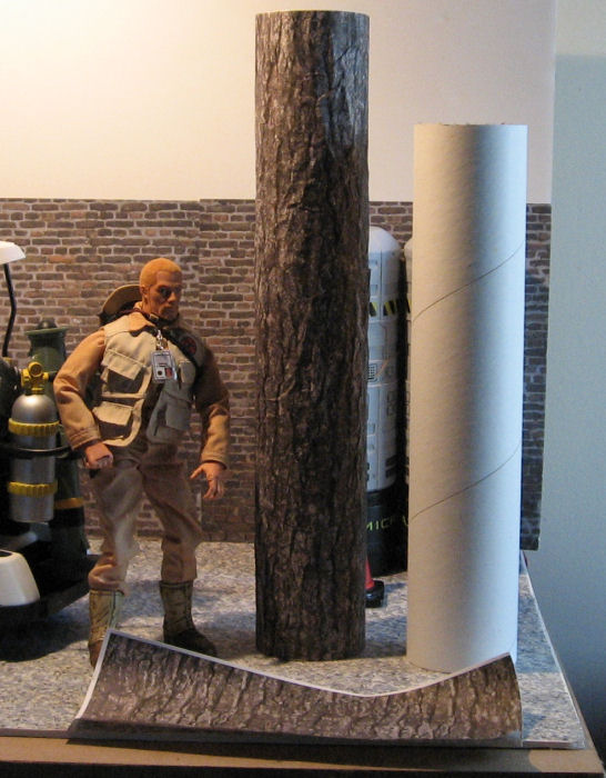
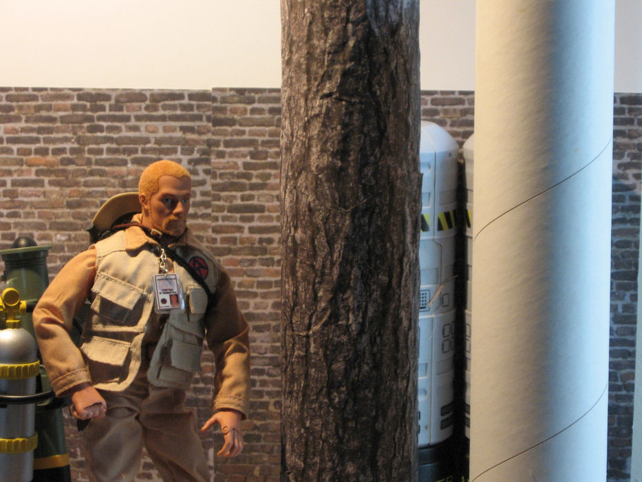
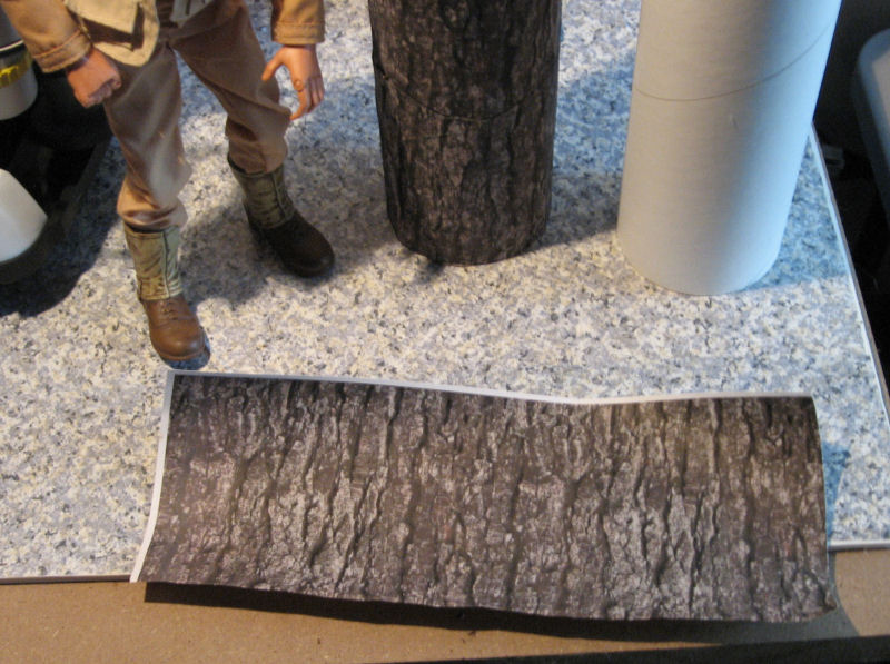
First, I selected my core form, a 3-inch mailing tube that I had laying around my shop. You can see a piece of the "naked" tube on the right side of the pictures. Most any cardboard tube would work, from a couple of paper-towel tubes spliced end-to-end, to a piece of carpet-tubing to create giant redwoods.

I determined that it would take most of three sheets to cover the tube, and that the long direction of my printed sheet would go around the tube with minimal overlap. For ease of construction, I decided to use transparent tape instead of glue. I carefully lined up all the joints so that the tape and seams are all hidden on the back side of the tree. (This is a key trick for pulling this stuff off easily. Don't build or detail things that people aren't going to see. The viewer's mind will fill in the rest of the bits that you leave off.)

I started at the bottom, trimming the white edges off the sheet where they'd show. This is where the real texture comes in. I then took the sheet and rolled it up into a small tube, then crushed it, rolling the resulting mess between my hands to add more folds and creases. Then I carefully flattened the sheet, which now had nifty texture that would pick up highlights and make the profile edges of my tree trunk look more realistic.

Razor-straight lines are a dead-give-away that something is artificial, and the human eye is very good at spotting straight-lines.

I took this in consideration when rapping the second sheet around the trunk. I planned to overlap the sheets slightly anyway, so I hand-trimmed the bottom of the sheet in a kind of "wave" that would help disguise the seam. After taping the sheet (both the lower sheets were also taped to the tube at the top, where the tape would be hidden by the overlap from the sheet above) I finished off with the final one.

I've got some ideas on how to add roots and limbs to my tree, but I haven't tried them out yet, and for a forest scene, the trunk is the most important part. You can whip up a whole grove of these in an evening while watching TV. Remember to used a variety of tube sizes and bark textures and colors for a more realistic "forest" You could even print out some "knot holes" and other tree features, cut them out, and paste them on for a more realistic look.

One other advantage of using multiple tube sizes is that you can store them compactly nested inside one another. Try that with something you rescued from your wood-pile!

Wednesday, July 19, 2006

Making a MinionMobile


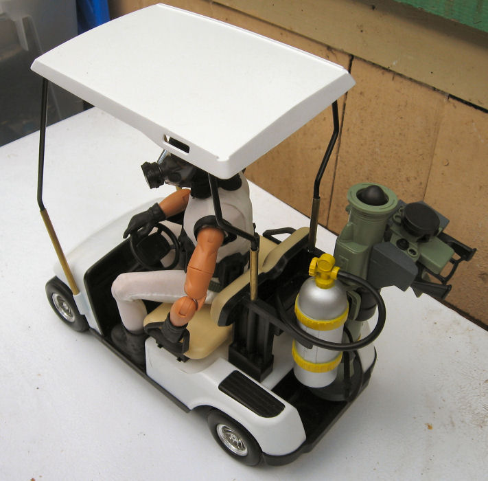
For some time, I've been considering making a custom vehicle for my "Minions" photo cartoons. I thought about a Barbie camper conversion or a Jeep or something in that size range, but it occurred to me that I had a possibly more useful candidate on hand. After all, any super-secret complex back in the 60s and 70s (good or evil) used industrial golf-carts to shuttle through its cavernous depths.

A while back, KB Toys had a nice looking toy golf cart for sale. Unfortunately, they were maybe 1/10th scale, just too small for 1/6th figures, so I passed on it. Then, some months back, I spotted one for cheap in a thrift store and couldn't pass on it. The body and roof are plastic, and the roof supports are heavy metal rod, and I thought perhaps I might be able to modify it for use with GI Joes.

I completely disassembled the toy for inspection, cleaning, and painting. I decided the original green body panels weren't industrial enough, so I went for a sterile, Krylon Fusion "satin white." The roof was already white, but I painted it as well, to make it more opaque and hide the plastic sheen.

My initial thought was that the cart could be stretched between the front and rear body sections to provide more leg room, and then the roof raised slightly. But as I looked at it, I realized that would be very complicated, and weaken the structure of what was actually a pretty rugged little toy. There was also the matter of the roof, which would either have to be stretched, removed, or have heavily modified supports.

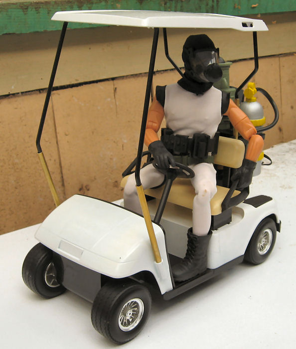
It was my wife, Chris, who came up with a better solution. She suggested that if the seat were simply raised so that the figure's knees weren't up in his chest, it would look much more in scale. It seemed possible that I could put some washers on the screws holding in the seat to raise it a bit, or perhaps even build a riser of some sort for it to sit on. The job was made somewhat more critical by the fact that the screws that hold on the seat and seat back assembly also hold on the rear body and contribute to the strength of the entire structure.

I decided that some kind of riser was going to be necessary, and before I started fabricating something new, I started digging through my parts boxes for something sturdy and ready made. Just for sizing purposes, I dug out some Lego blocks to see how high the seat should go. But after looking at the blocks for a while, I realized that they'd be ideal as the risers themselves.

I have to admit, adding Legos to a permanent construction project seemed somehow "wrong," especially since I had to drill a hole through the centers of the blocks for the screw, and modify the "buttons" on top of the rear risers so the seat-back/cargo holder assembly would sit flat. But Legos are cheap, and I have a ton of them (I can't resist buying them when I see them cheap in thrift stores, so I've got quite a collection). Not only were they sturdy and perfectly sized, but I was even able to get black ones so no painting was necessary!

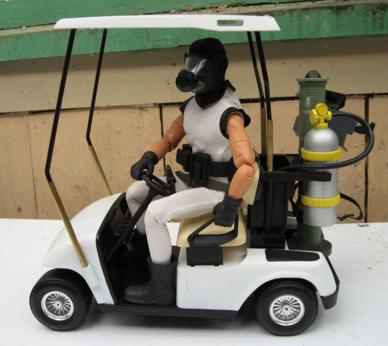
The seat sits on a pair 2x4 block risers, two-blocks tall. Same for the seat-back assembly. I replaced the original screws with longer #6 sheet-metal screws selected from the hardware store.

That done, it was time to raise the roof. This was complicated in that not only did it now need a "scale" adjustment to allow for the taller figure, but now the seat itself was higher. I used threaded rod from the hardware store to make pins that fit in the original roof mounting holes, then cut sections of brass tubing (hobby shop metal stock) to slide over the pins and the bottoms of the original supports, connecting them together. These are just friction fitted at the moment. Some epoxy may eventually come into play, and I'll paint the tubing black to match the existing support posts.

The very tall appearance has a bit of "clown car" aspect to it, but it isn't bad, and the Minions ARE supposed to be funny, after all. I looked around for some accessories to fit in the club rack in back, and found first a scuba-tank from one of those cheap 14" Action Man knock-off figures that Wal-Mart used to sell. Poison gas, maybe? Something radioactive? Then I noticed a Hasbro javelin anti-tank missile, and sure enough, it was a perfect fit in the other side of the rack! The Minions are loaded for bear! I thought the idea of this silly little cart with a missile on it was just funny in itself.

I'm still not finished. The steering column needs to be longer and more vertical, and I may add a larger steering wheel while I'm at it. Not sure. I'll probably add a few markings as well, but I'm still thinking about that. "Official Lair Business Only," maybe?

Monday, July 17, 2006

DVD Extras for "Minions: Walking the Dinosaur"


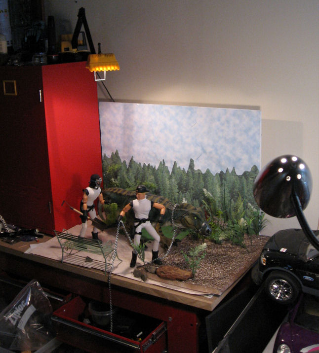
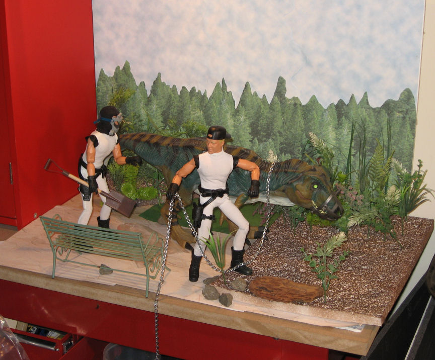
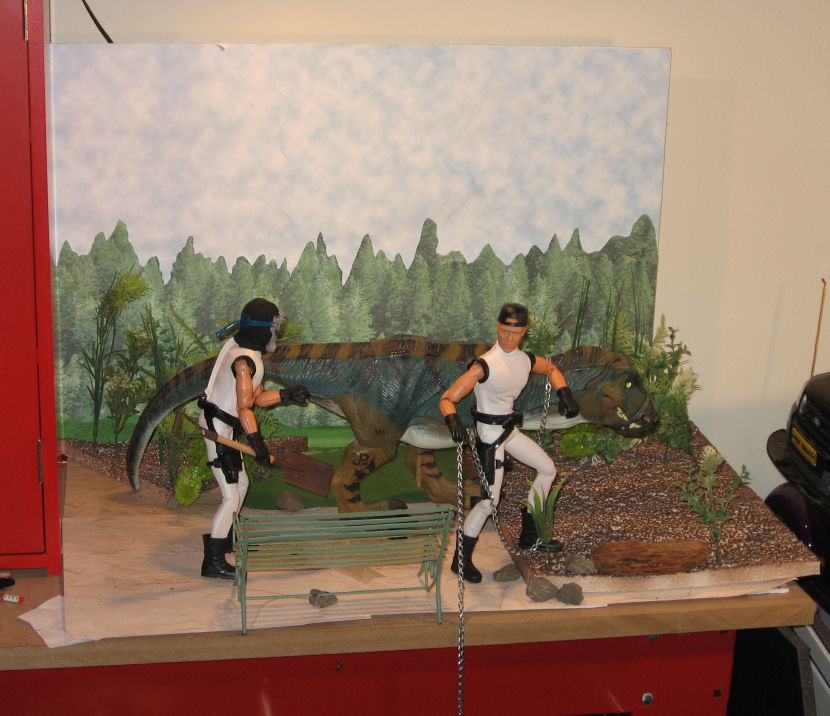
I'm really pleased with how this installment of "Minions," titled "Walking the Dinosaur" turned out visually, so here are some "behind the scenes" shots of the set.

I made extensive use of printed papers sold in craft stores for scrapbooking in this set. The ground is simply overlapping sheets of a "stucco" print. There are also some small scraps of a "grass" print to break up the lines. The backdrop is a cut-and-paste job onto a sheet of foamcore, using pieces of two different sheets, a "cloudy sky" sheet, and a "pine forest" pattern. I covered most of the sky with overlapping sheets of the sky pattern, then filled in the horizon with hand-cut pieces from the "forest" sheets. I probably used about four sheets of each.

The "dirt" area is actually a sheet of scrap packing foam hit with brown spray paint. I didn't use foam-safe paint, so it melted the surface into an irregular texture, and bits of white foam are showing up through the foam. I wasn't sure how it would work, but seen from the side, the white actually breaks up the dark brown and makes it look more like a natural ground-cover.

The plants are all plastic, consisting of bits of aquarium plants (bought cheap at a thrift store), and some dollar-store mixed greenery that I took apart to make smaller plants. The rocks are just some driveway gravel I picked up right outside my office door. The brown "log" is actually a piece of driftwood, the only real plant mater in the shot.

The park bench is metal. I found it in a thrift store (in metal housewares, not in toys) for about two bucks. The shovel is a craft-store item. The chain was purchased by the foot at the hardware store. The dinosaur is a "Jurassic Park" T-Rex, possibly one of the nicest toy dinosaurs ever made. I currently own three of them, and I'm always keeping my eyes open for more.

I did do a slight bit of digital retouching in Paint Shop Pro, using the "clone" tool to hide the edges of the foam sheet, and the "smear" tool to break up the edges of my cut-out trees and make them look more realistic.

The whole thing only took me twenty minutes or so to set up using things I had on-hand. I pays to think ahead and stockpile basic backgrounds and props like these.

Tuesday, July 04, 2006

Cut and Paste

Astro-Dan has been posting a series of figures computer blended into historic photo backgrounds, and over on the Sandbox we've been discussing tips for realistically blending a figure with the background. This is more art than science, and requires supplying the eye with cues that trick it into thinking the overlaid foreground is part of the photo background. You could write a book about it, but here are a few tips from this non-expert:

1: Match the shadows and light sources. The eye and brain are really good in picking up these cues, especially in photos, where this is how we judge the depth and size of the objects in the 2D picture. At the very least, try to match the primary light source.

Look at your figure. Where are the shadows on the face? If they're on the left, the light source is on the right. If they're on the right, the light source is on the left. If they're under the brows, nose, and chin, then the light is coming from above. This should match your background photo as close as possible. If there are no distinct shadows, or the shadows aren't pronounced, then the light on the figure is diffuse. If there are strong shadows in your background, it won't match.

One trick that sometimes works: if your figure has the light source on one side, and the background has the light on the other, its sometimes possible to flip one or the other (mirror image) and make it match. Obviously this doesn't work if there's something in the image to establish the "handedness" of the image. Any flipped writing will be backwards. Car steering wheels will be on the wrong side (but hey, we could be in England!). And Joe's scar could be on the wrong cheek!

2: Match the contrast of the background. Nothing will give away a "paste job" faster than a high-contrast figure against a washed-out background shot. Your photo editing software will probably have a brightness and contrast tool. It may have other brightness tools that are even more powerful (though they can be more difficult to figure out and use).

3: Match the color tone. Figure photos taken inside under incandescent lights are often "warm" in color tone. Fluorescent light sometimes results in a greenish tone. Photos taken outside under sunlight usually have a bluish tone. Your photo editing software probably has tools to fix this.

4. Match the color saturation. Modern photos taken under artificial light often have bright, over-saturated, colors. Historic photos taken outside often have muted, washed-out colors. Foreground should match background.

5. Match size and perspective. It's pretty basic that things that are closer are bigger, and that things which are farther away look smaller. In a photo scene, things contract towards an imaginary "vanishing point," which (on a flat plain, anyway) will lie along the horizon.

I could go into a big, not very informed lecture about perspective here. Trust it to say that your eyes and brain judge the size and distance of an object in a picture by its position in the picture in relation to other objects.


Take a look at this example I whipped up. The lines on the football field converge on our "vanishing point," illustrated with the red lines converging on the (hidden) horizon). On the left, I've arranged four figures positioned to appear the same height, even though each is about 20% smaller than the next. Note that as they stand on a line towards the vanishing point, another such line connects the tops of all their heads. Yes, I know that they look about 12-feet tall, but they ALL look 12-feet tall. That's what's important.

Now look at the figures standing along a similar line on the right. Believe it or not, these are the SAME four figures. I've just reversed the order. The monster standing back-rightis EXACTLY the same size as the more normal-looking guy standing front-left. The tiny shrimp front right is EXACTLY the same size as the fellow back left.

Likewise, any figure you paste into a photo background has to relate properly to the objects around them, or they're going to appear to be a giant, or a shrimp, or just hanging in the air in front of a distant scene, or worst of all, just pasted on a flat background like a stamp on an envelope.

Experiment with size and position relative to the background, and trust your eye on this. One trick I find useful is to look at the figure's feet. Though the imaginary plain leading off to the horizon may be flat, to your eye it SEEMS steeper as it's closer to the observer, and flatter towards the horizon. If you're looking down at the tops of a figure's feet, then it probably belongs close to the front of your image. If that makes him look gigantic, then he needs to be made slower. If, on the other hand, you seem to be looking at the sides of the shoes straight-on, then he belongs off in the distance, and should be positioned and resized accordingly. Use people, doorways, and other such details as reference in positioning your foreground picture.

Notice how the giant on the right rear seems to be up on his toes, about to topple forward, or to launch himself into the sky. That's a foot position cue at work. He needs to be closer to the bottom front of the picture.


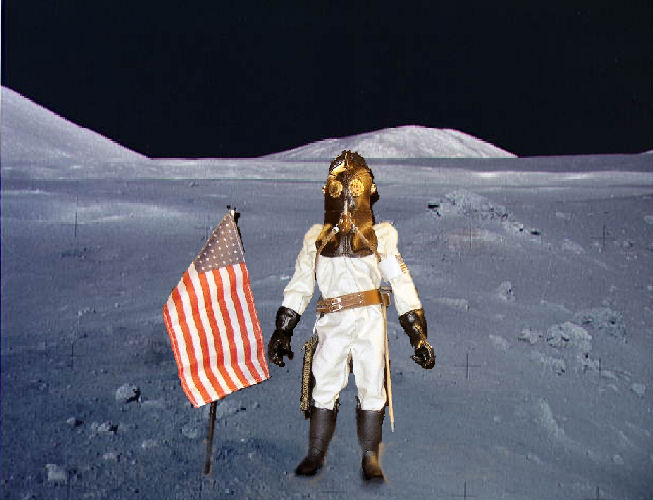
Okay, this is a quick example of putting these rules into practice, hijacking one of Dan's own images, his 1912 lunar astronaut. I've dug a NASA lunar photo out of my files and added him in.

This first example is done wrong. First of all, the position of the figure is wrong. He's too close to the front, and seems to be tipping backwards on his heels. One would expect light on the moon to be bluish and colors somewhat subdued. Instead, the figure is very saturated, and the colors warm. At best, he looks like he's standing in front of a photo backdrop. At worst, it's the stamp and envelope effect.

Now this next one isn't perfect, but it's not bad. I've cooled off the colors in the figure, increased the contrast, and reduced the color saturation, to make him fit with the background better. A couple of additional tricks. I added some blotchy shadows under his feet and to the right of him and the flag. These don't exactly match either the sharp shadows on his suit, of the washed-own and almost shadow-free background, but they do help to "ground" him in the scene. One other little trick, I copied a rock from the background (and reshaped it a bit, but that isn't necessary) and put in in FRONT of the toe of one of his boots. Again, that helps to "stick" him to the scene.

Again, though the figure in the "bad" image seems bigger, it's exactly the same size relative to the background as the "good" image.

This post really just scratches the surface, but hopefully it will provide some useful tips to apply in creating your own photos.

True undersea adventure


I'm going to break from the usual around here to review a book I just finished. It's called Dark Waters: An Insider's Account of the NR-1, the Cold War's Undercover Nuclear Sub, by Lee Vyborny and Don Davis.

The 1960s were a period of stunning technological change and exploration, both in space, in the air, and under the water. It was the era that excited the young imaginations of so many of us, and inspired the GI Joe Adventure Team. But while many of these developments and adventures took place in the public eye, some went on in near secrecy.

A prime example of this is the NR-1, a one-of-a-kind, deep-diving, nuclear powered mini-sub developed by the US Navy. Announced under the cover of being a scientific vehicle, in truth the little sub was primarily designed for military applications (though in later years, its unique capabilities would lead to many scientific discoveries).

The NR-1 could dive at least 3000 feet, hover above the bottom like a helicopter, roll along the ocean bottom on a pair of retractable wheels, view the bottom through cameras and manned viewports, and manipulate objects using a robot arm, and lift heavier objects with tines like a forklift. Most significantly, it's nuclear power plant could supply its small crew (no more than a dozen men) with air and drinking water indefinitely, drive powerful lights, and allow stays on the bottom for up to a month (though in cramped and inhospitable conditions).

Many of the NR-1's missions remained classified, but this book still provides a fascinating and thrilling account of the little sub's creation, testing, and many of its adventures. Seemingly every mission of the NR-1, even the seemingly most routine, was filled with peril and the constant threat of disaster. Access to the interior of the sub was through a single, tiny, hatch, it routinely dived into depths and locations where no other sub on Earth could come to its rescue. It challenged uncharted canyons, unknown currents, abandoned mine-fields, and lost fishing nets in its missions, and being the first-ship of its kind, the crew was literally making up the rule-book as they went along.

One of the most fascinating accounts deals with the recovery of a lost American fighter-plane and the then-new and top-secret Phoenix missile from the bottom of the Mediterranean. Not only was the mission dangerous and technically challenging in itself, but it was complicated by the layers of secrecy (the men on the submarine were not even told what the missile they were looking for looked like!) and aggressive Soviet spy ships that circled like hungry wolves, desperate for any opportunity to snatch the missile for themselves.

Though the NR-1 often operates under the cloak of secrecy, since the fall of the Soviet Union it has increasingly cooperated in scientific missions, and among its high-profile assignments was recovery of wreckage from the Space Shuttle Challenger that lead directly to solving the cause of that terrible disaster.

This is a wonderful book, much of it derived from Lee Vyborny's own experiences as a member of the NR-1s first crew. It sheds light on a fantastic machine and the men who created it, a machine in its own way as bold and advanced as the Apollo Moon missions. But unlike the Apollo program, the NR-1s missions are ongoing, and it continues to sail today.

Unfortunately, I'm not sure if this book is still in print. I discovered my copy in a book liquidator, and Amazon claims to be able to order a new copy in "1-3 weeks" of which I am doubtful. But it's well worth tracking down on Amazon or through a library or used bookstore.